|
|
主题: 你看这样有一点像吗?
|

electree
职务:普通成员
等级:1
金币:0.0
发贴:55
注册:2002/7/2 11:08:13
|
#12003/6/16 21:55:45
图片如下: 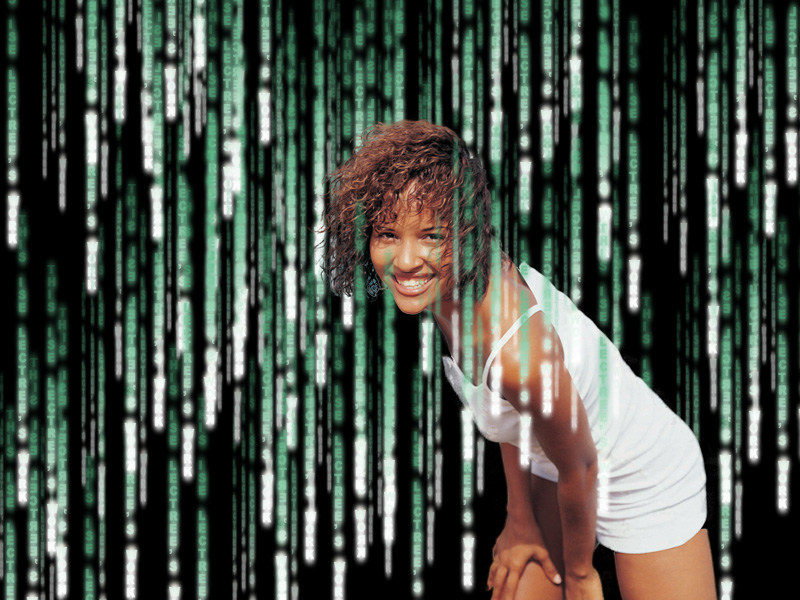 文字多做几种效果,这里只是同一种的重复。 还有模糊多了一些。基本上就这个样子了。
|
electree
职务:普通成员
等级:1
金币:0.0
发贴:55
注册:2002/7/2 11:08:13
|
|
杀手武神
职务:普通成员
等级:1
金币:0.0
发贴:23
注册:2003/6/11 5:20:18
|
#32003/6/17 2:15:07
这是什么效果呢?
呵呵???
什么效果呢?
|
大脚瘦子
职务:普通成员
等级:1
金币:0.0
发贴:73
注册:2003/3/17 23:44:33
|
|
Nireackyn
职务:普通成员
等级:2
金币:5.0
发贴:332
注册:2003/3/29 20:03:00
|
|
bear99269
职务:普通成员
等级:1
金币:0.0
发贴:13
注册:2003/5/24 12:38:33
|
#62003/6/17 10:13:40
应该是在一个新图层做了文字效果后再对这个图层复制,进行多次粘贴,并对某些图层做不同的透明,大小处理。
|
寒江钓客
职务:普通成员
等级:1
金币:0.0
发贴:108
注册:2003/6/16 17:40:20
|
#72003/6/20 13:38:12
有点明白~~~~ 好象是先打字~~~ 多建几个文字层,没俩个层文字大小不一,然后建组! 然后建蒙板~~~~ 在蒙板上执行云彩滤镜~~~~ 将文字删格~ 调整对比度~~~~ 哎!还是哪个高手翻译一下吧~~~~~~ 
|
electree
职务:普通成员
等级:1
金币:0.0
发贴:55
注册:2002/7/2 11:08:13
|
#82003/6/20 20:34:22
翻译什么?你把英语原文帖过来,我翻。
|
寒江钓客
职务:普通成员
等级:1
金币:0.0
发贴:108
注册:2003/6/16 17:40:20
|
#92003/6/21 10:09:43
Open a new Document, whatever size you like. Give it a black background layer. Create a new layer and select the type tool.
Now we'll get to work on creating that text with all the strange characters. How do we do it? Well, we could spend half the day typing strange keyboard combinations or call on the help of an every day text editor. Since I'm on a Mac the obvious choice is BBEdit. For PC's, I dunno, maybe word or something will work. What you do is open up a graphic file not supported by the text editor. I found opening a TIFF file worked quite nicely.
Look at that! Just like Matrix text except horizontal and not so glowing. Woo, now we're cookin. Select a big ol' chunk of text out of the middle somewhere and copy it to the clipboard. Head back into Photoshop next.
With the type tool selected click and drag over the entire document to create paragraph text. Next select vertical type by clicking the icon in the left corner of the tool options bar, then select top align. Then, open the Character and Paragraph Palettes. Choose a nice computer font. I used Courier New. Set the font size to 6 px. Choose a green color for the text. Now paste your text from the clipboard and accept it by clicking the checkmark in the tool options bar. Set the Tsume to 70%. This reduces the space around the characters by 70%, scrunching them together more like the matrix text.
Set the spacing to 10 px and duplicate the layer. Change the font size to 8 px and the spacing to 15 px. Set the layers blend mode to Linear Dodge.
Duplicate that layer. Change the font size to 10 px and the spacing to 30 px.
OK. Getting kinda busy isn't it? Let's work towards a little randomness now. Click the layer mask icon at the bottom of the layers palette and set your foreground/background colors to default black and white (d). Choose Filter>Render>Clouds then Image>Adjustments>Brightness/Contrast. Slide the contrast all the way up to +100%. Give it gaussian blur of about 20 pixels. Do this with all three text layers and it should be looking better, but we're not done yet.
More randomness is in order. More masking is in order too. Create a new layer set by licking the folder icon at the bottom of the layers palette then drop your 3 text layers in there. Make sure the layer set is selected and click on the layer mask icon. This time we'll be spending a little more time with our masking. Choose the brush tool and select a 6 pixel, hard, round brush. Make sure black is your foreground color and start painting away strips of text being sure to leave lone strips falling down by themselves. You'll want to take more from the bottom than the top and just kind of break it up some in the middle. Remeber if goof you can always paint stuff back in with white, your text isn't really being harmed. The beauty of layer masks.
Now let's give the text a little glow. Duplicate each text layer. After you duplicate it right click on the layer and choose "rasterize layer", then right click on the layer mask thumbnail and choose "apply layer mask". After you've made a rasterized copy of all 3 text layers and applied their layer masks move them beneath the text layers and merge them together. Give them a gaussian blur of about 1.5 pixels. Click the layer mask button again and choose render clouds. I just thought it looked lonely down there all by itself without a mask to keep it company. Almost done.
Create a new layer above the layer set. Select the transparency of all 3 text layers by command clicking on the first layer and then shift-command clicking on the last 2. Press command-h to hide the selection so you can see what your doing. Set white as your foreground color and paint in highlights for the text. Deselect and give it a gaussian blur of about 1.5 pixels, set the blending mode to Color Dodge and drop the opacity to about 80%.
This one's optional. If your color seems a little bit off like mine did just add a hue/saturation adjustment layer and slide the hue around until you're happy.
Now we'll do the big text. Create a new layer on top. Select the type tool and a font that looks good for the job in capitals. I used Palatino at 48 pixels. You could probably find a better Matrix font at one of the download sites if you wanted to. You should also reset your tsume and spacing back to normal in the character palette. Type your text in white and duplicate the layer twice. Rasterize all 3 layers. Go to the bottom text layer and tick the preserve transparency box in the layers palette. Fill the layer with the color you used for the background text and uncheck the preserve transparency box. Do this for the middle text layer as well. On the bottom text layer choose Filter>Blur>Motion Blur, set the angle to 0 and blur it until it looks about right. On the middle text layer make sure preserve transparency is off and choose Filter>Other>Minimum and enter a setting of 2 pixels or so depending on the size of your type. Now give it a small gaussian blur, maybe 2 or 3 pixels. On the top (white) text layer select the rectangular marquee tool and select a piece of text on one of your letters. Then select the move tool and nudge the selection any direction you want by 1 or 2 pixels. Repeat as necessary until you're done. Link the three text layers together and position them wherever you want. That's it, you're done.
In hindsight I think this effect could probably be improved by using more text layers, especially the smaller ones, and varying the spacing more but at the moment I don't really care to go back and rewrite the tut for it. The best advice I can give for achieving any effect is to look at an example and try to recreate that. Just play around trying different things until you get it right.. you'll learn so much in the process and won't need tutorials for everything anymore. That's exactly what I did here, I just took the time to type it out as I fiddled.
|
electree
职务:普通成员
等级:1
金币:0.0
发贴:55
注册:2002/7/2 11:08:13
|
#102003/6/21 14:39:58
新建一个文档,大小自定,建一个黑色背景的层,建一个新层,选择文字工具。 下面我们来做那些奇怪的文字。怎么做呢?好的,我们会用一大半天的时间来用键盘输入这些奇怪的文字组合或是用其它常用文字编辑的工具来帮忙。因为我用的是苹果的 Mac 系统,我自然选择使用 BBEdit(这是一种文本编辑工具),至于PC电脑,我不知道,也许是word 或是其它一些可以用的软件吧。你所要做的就是打开一个不支持文字编辑的绘图文件,我发现打开一个 tiff 格式的文件用起来很爽。 看吧,除了是水平排列和没有发光外,还是很像黑客帝国里的那些吧。我们开始做了,在这一大段文字中间选一大部分,复制到剪贴板。然后我们回到photoshop。  选用文字工具,用纵向文字排列工具,拖出一个有整个文件大的文字区,选择顶部对齐。然后打开“文字\段落”面板选一种好看的字体。我用的是“courier new”,设置文字大小为6个像素。为这些文字选用一种绿色。接下来粘贴上刚刚复制的文字,并按工具选项栏中打勾确认。设置文字紧缩70%,(为什么我用的photoshop里的文字面板没有这么一个选项呢?我用的是7.0——译者注)这样减少了每个字周围的70%空间,使之紧凑,看起来更像“黑”里的文字。 将行距设为10个像素,复制这一个层,将(新层)文字大小设为8个像素,行距设为15个像素,将图层混合模式改为 liner dodge 再复制这个文字层,将文字大小设为10像素,行距为30像素。 是不是觉得有点手忙脚乱的呢?我们来做点随意点的工作吧。点击图层面板下面的图层蒙板按钮,设置你的前景色和背景色为默认的黑与白(按D键)。选择 滤镜\渲染\云彩 然后选择 图像\调整\明暗对比 将对比度一直拖到+100%。高斯模糊20个像素。对这三个文字层都做以上相同的操作,看起来会更爽,不过我们还没有完成呢。 下面还会有更多的随机操作和蒙板操作。建一个新的层集(层面板下的文件夹按钮),将刚才做的三个文字层拖进去。选中这个层集,并给它建一个蒙板。这一次我们将花更多的时间在蒙板上。选用6个像素的硬,圆笔刷。当前色为黑色,涂去(多余的)文字束,使文字束干净利落地落下。下面要涂得比上面多一些,中间涂一些。记住,如果涂坏了的话,只要用白色涂回来就可以了,你打的字并没有受到破坏,这是图层蒙板的功劳。  下面我们开始让文字闪起来。复制每一个层,复制后右键点击这些层,并选“光栏化”操作。光栏化这三个层后(请注意,这三个层都是有自己的图层蒙板的),分别运用这三个的蒙板,将这三个层(光栏化了的三个层)合并,并移到文字层的下方。高斯模糊约1.5个像素,再给这个层加上一个蒙板,用“云”渲染。我觉得要是不用一个图层蒙板的话,看起来会有点单调。差不多就快做完了。 在层集之上新建一个层。按下command键并单击第一个层,然后按下shift + command 键并单击下面的两个层,以此来选择这三个(文字)层的透明(部分)。按下command + h 键,隐藏选区,这样你就可以看清楚你所做的了。设整白色为前景色,在文字高光的部分涂上白色,取消选择,高斯模糊约1.5个像素,将图层混合模式改为 color dodge 把不透明度降为约80%。(译者个人认为command可能相当于pc中的ctrl键) 下面这一步可以有选择性地做一下,如果你的平面看起来暗了些,像我的这样,加一个“色相\饱和度”调整层,将色彩调到你感到满意为止。 下面我们来做大的文字。在顶部新建一个层,选用文字工具,用一种适合大写字母的字体。我用的是48像素的palatino体。你只要愿意,可以下载到更适合用于"黑"的字体。你得把刚刚调整过的文字缩进和行距再调回到正常。用白色打字,两次复制这个层。将三个层都光栏化,选(这三个层中)最下面的一个层,选中"保留透明"(在文字工具面板中,)用刚才用过的绿色填充,再将刚刚在"保留透明"中打的勾云掉。同样的操作用于中间这一个层。选下面的那个层,用0度角的动感模糊,自己把握模糊的度。选中间那个层,确定不选中“保留透明”选项,用:滤镜\其它\最小值,输入2个像素的值。以你输入文字的大小而定。再来一个2到3像素的高斯模糊。用矩形选择工具选取最上层的白色字体的某部分,向你喜欢的方向(用移动工具)移动1,2个像素。如果你喜欢的话可以重复几次。将这三个层链起来,放在你想放的地方,这就完成了! 最后一段个人的感想,不译了。
|
electree
职务:普通成员
等级:1
金币:0.0
发贴:55
注册:2002/7/2 11:08:13
|
#112003/6/21 14:45:01
有什么地方看不懂的也不要来问我,我也搞不清,总觉得老外讲的和我用的有一点不同,至少面板有一点不同,可能它用的是6.0版吧。还有选择"保留透明"什么的,我从来没有过。 要是我可以做出更cool的效果,再发个我的教程吧,只是可能性不大。 :) 交个朋友吧。暑假真是寂寞呀。 
|
独孤一啸
职务:普通成员
等级:1
金币:1.0
发贴:207
注册:2002/2/23 13:23:55
|
#122003/6/21 16:50:09
PFPF。
|
寒江钓客
职务:普通成员
等级:1
金币:0.0
发贴:108
注册:2003/6/16 17:40:20
|
#132003/6/22 14:34:55
呵呵~~~~~~~ 楼上地~~~ E文8错哟! 我也是用6。0 习惯了~~~~ 但liner dodge 到底是什么模式,始终找不到!
|
寒江钓客
职务:普通成员
等级:1
金币:0.0
发贴:108
注册:2003/6/16 17:40:20
|
#142003/6/22 14:35:42
独孤一啸在上个帖子中说 引用:
PFPF。
独孤一啸 我也是九华山的! 我在青阳~~~~~~~~~~~~
|
electree
职务:普通成员
等级:1
金币:0.0
发贴:55
注册:2002/7/2 11:08:13
|
#152003/6/22 21:06:20
liner dodge
线性减淡
在图层面板上的图层混合模式里。
color dodge
色彩减淡
|


