|
|
主题: 边缘的威力(编辑中,未完)
|

qinmenfei12
职务:普通成员
等级:2
金币:3.0
发贴:539
注册:2004/10/12 10:40:45
|
#162004/12/19 10:12:52
zhuzhu!在上个帖子中说 引用:
你应该知道,把我的话当作放屁会有什么后果。作为教程的翻译最好认真负责一点,尽量做到完善每个环节。【mask channel】翻译成蒙版,谁知道是图层蒙版还是快速蒙版?
就知道擦出轮廓,用罐头灌满,再用魔棒一点了事....还分什么图层快速?第一次听说....5555555....这年头混口饭吃不容易啊...昨天在海口买的一堆天津瘟神牛顿油画颜料还等着我去 搞她们...第一次搞油画... 
|
qinmenfei12
职务:普通成员
等级:2
金币:3.0
发贴:539
注册:2004/10/12 10:40:45
|
#172004/12/19 10:21:36
继续继续:
The first rule- get rid of the white of the paper fast and work out the big areas as soon as you can. Beginners (I did this too!) like to start at one corner and finish as they march across the image. Don't think of things as objects that need to be separated logically. What would you really see? Look at the leg and ground- the edge is lost where they share the same value and color. This is another mistake beginning painters make- edges and boundaries where the eye would see none. I see it a lot in 3-d work as well.
At night look at some trees where they meet the sky. Because the light level is low, the edge is softer than it would be in the daytime. The eye has a harder time differentiating two values in lower light. So in the shadow side of an object, the edges tend to be a little softer. This is probably the most important determining factor of edge quality. Look at a good head painting: the shadow side has softer transitions. The softest edges area probably where the hair meets the background in shadow. In places you might loose that edge entirely! Most beginners think "there's the hair, and there is the background, there has to be a separation there somewhere." This is where painting from life would help. I did this image from my head, but I could not have without a lot of life drawing and painting.
这两段的大意是:绘画初学者常犯的错误(由思维定式引起)及如何通过正确的观察,写生练习纠正.
There are other considerations about edges(边缘) as well. There is a hierarchy(层次) of edges(边缘) in every image. You play up the sharpness of some edges and some fall away. Yes it is a matter of contrast, but also a matter of manipulating the viewer, and part describing materials. The spear is sharp and precisely drawn: this by contrast gives the figure a softer appearance, feeling more like flesh. The hair is softer still. If you were rendering a face, you could play up the differences between hair, soft fatty tissue, bonier areas, metal implants, etc.
呵呵这段可是核心段哦重点翻译:用边缘层次体现空间层次的高级手法!根本性在于对比!世界是在对比中存在.大一的湖南美术刘老师上课时说,也是我唯一记住的一句,终身受用.
Another consideration is to play up the difference between form and cast shadows. Since the lighting is diffuse, or from a large source, as opposed to a point source, this is not really an issue, and if you don't know what I am talking about, we will get to that subject in a later column!
In many Frazetta paintings the feeling of action and tension is accentuated by hiding the far arm or leg behind the body. This is good example of what is left out is more effective than what is included.
Also in the interest of simplicity I only included the most important landmarks of the body, the rib cage and then the arm and shoulder on top of that. The body bends below the ribcage. The weight of the body is being transferred through the shoulder to the arm and out to the hand on the spear. This is causing the arm and shoulder to ride up and around the ribcage. It is important to show this to give the body a feeling of weight, and in this case, a feeling of fatigue.That the hair is stringy and matted also helps here.
I work a lot with silhouettes(我下了很大的工夫在轮廓上 and if you look at the figure and the ground, they function together as one. I saw the body emerging out of the ground as one shape, and as you can see the edge between the leg and the ground is totally lost.
I had originally planned to play up the texture in the body to contrast with the flatness of the sky, but I ran out of time (I loose interest when the problem is solved in my head, or in this case, about an hour). The hazy sky is like a summer afternoon thunderstorm, with the humidity in the air exaggerating the atmospheric perspective. This gives the feeling of a large open space, and makes the figure seem more alone in a large universe. I will talk more about atmospheric perspective in a later column. The ocean in the lower right is out of focus, which is actually an error, but it didn't bother my eye too much. Those rocks are a lot closer than the sharp edge of the clouds in the upper left, and they should both be in focus. I don't play with depth of field much, as it is a characteristic of bad model photography or bad lighting that requires the lens of a camera to be opened up for a given film speed. There are much better ways to show depth.
The low level of lighting dictates a similarity in the basic color and contrast of materials. The wooden shaft of the spear, the metallic head, skin, hair etc. are all the same color and value, or nearly. As I said before, I did differentiate them with edge quality(我的确是用边缘来区分它们), but if there was more light on the subject, you would see large differences in the treatment of materials. The edges would also sharpen up as well. That's about it for now, I know this is a sketchy pic to gab about this much, but I hope you have gotten something out of this ramble. I will have a plan in the future and keep each column to a specific subject, and not all over the map as I have done here. Maybe with that degree of focus I can communicate better.
编辑历史:[此帖最近一次被 qinmenfei12 编辑过(编辑时间:2004-12-24 11:18:00)]
|
fengxicg
职务:普通成员
等级:1
金币:0.0
发贴:9
注册:2004/12/19 11:47:49
|
#182004/12/19 12:35:51
还是不太明白,就是说画云彩,不能用线条勾勒出边缘,要用圆头笔刷大面积的的画,但那云彩的边缘地方,应该如何画???
|

zhuzhu
职务:版主
等级:9
金币:91.3
发贴:22562
注册:2002/8/14 17:56:15
|
#192004/12/19 12:40:55
fengxicg在上个帖子中说 引用:
还是不太明白,就是说画云彩,不能用线条勾勒出边缘,要用圆头笔刷大面积的的画,但那云彩的边缘地方,应该如何画???
用涂抹工具或者喷笔来柔和边缘。
|
zhuzhu
职务:版主
等级:9
金币:91.3
发贴:22562
注册:2002/8/14 17:56:15
|
#202004/12/19 12:42:35
qinmenfei12在上个帖子中说 引用:
就知道擦出轮廓,用罐头灌满,再用魔棒一点了事....还分什么图层快速?第一次听说....5555555....这年头混口饭吃不容易啊...
软件的技术方面你还嫩着呢,以后这类问题在我面前谦虚一点。
|
fengxicg
职务:普通成员
等级:1
金币:0.0
发贴:9
注册:2004/12/19 11:47:49
|
#212004/12/19 12:44:43
这一步看了很久一直看不明白,自己也动手试了试,好像就是画不出那种犀利效果,可能是用笔还不太娴熟吧...,楼主可以分析的详细些吗?还是就是那个纹理,是一边画一边添加纹理还是,画完之类去添加上去的???[size=5][/size] 图片如下: 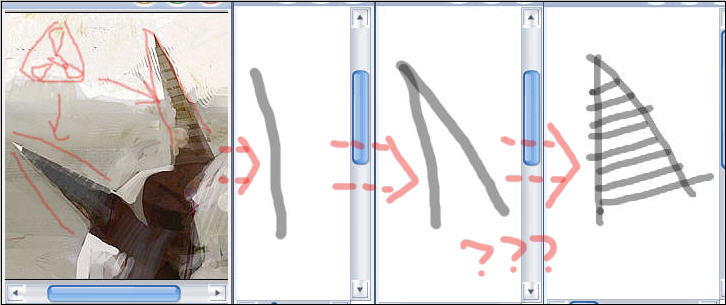
|
zhuzhu
职务:版主
等级:9
金币:91.3
发贴:22562
注册:2002/8/14 17:56:15
|
#222004/12/19 12:47:55
fengxicg在上个帖子中说 引用:
这一步看了很久一直看不明白,自己也动手试了试,好像就是画不出那种犀利效果,可能是用笔还不太娴熟吧...,楼主可以分析的详细些吗?还是就是那个纹理,是一边画一边添加纹理还是,画完之类去添加上去的???
叠加扫描的画布笔触纹理,然后用锐化工具强调边缘。
|
fengxicg
职务:普通成员
等级:1
金币:0.0
发贴:9
注册:2004/12/19 11:47:49
|
#232004/12/19 12:56:56
ZHUZHU老大的这句话,好像要配合那个S作画典藏贴子才能看的明白... 谢谢老大!!! 
|

OREZ
职务:普通成员
等级:8
金币:0.0
发贴:61
注册:2004/11/12 21:48:56
|
#242004/12/19 15:25:36
看了那篇gunman的教程开始对自己以前的观察方式有所反省了 
|
qinmenfei12
职务:普通成员
等级:2
金币:3.0
发贴:539
注册:2004/10/12 10:40:45
|
#252004/12/19 23:14:31
fengxicg在上个帖子中说 引用:
这一步看了很久一直看不明白,自己也动手试了试,好像就是画不出那种犀利效果,可能是用笔还不太娴熟吧...,楼主可以分析的详细些吗?还是就是那个纹理,是一边画一边添加纹理还是,画完之类去添加上去的
图片如下: 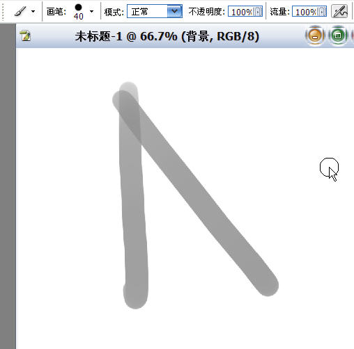 图片如下: 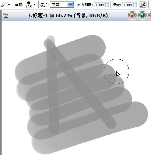 图片如下: 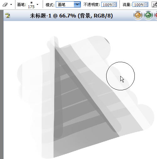
|
qinmenfei12
职务:普通成员
等级:2
金币:3.0
发贴:539
注册:2004/10/12 10:40:45
|
#262004/12/19 23:17:25
终于知道有人对这篇东东感兴趣了......我哭啊....
|
qinmenfei12
职务:普通成员
等级:2
金币:3.0
发贴:539
注册:2004/10/12 10:40:45
|
#272004/12/19 23:20:39
实在不行,用一下尺子...
|
fengxicg
职务:普通成员
等级:1
金币:0.0
发贴:9
注册:2004/12/19 11:47:49
|
#282004/12/20 0:27:43
qinmenfei12在上个帖子中说 引用:
终于知道有人对这篇东东感兴趣了......我哭啊....
我也哭啊~~~5555,终于找到了同伴... 我终于知道了橡皮擦的另一个功能,可以当笔用,那擦出来的笔触很帅气的说 不过我还有一些地方不太明白... 第一个图深入画到第二个图,那应该是新建一个图层,用叠加的属性继续深入画下去的 是吗? 图片如下: 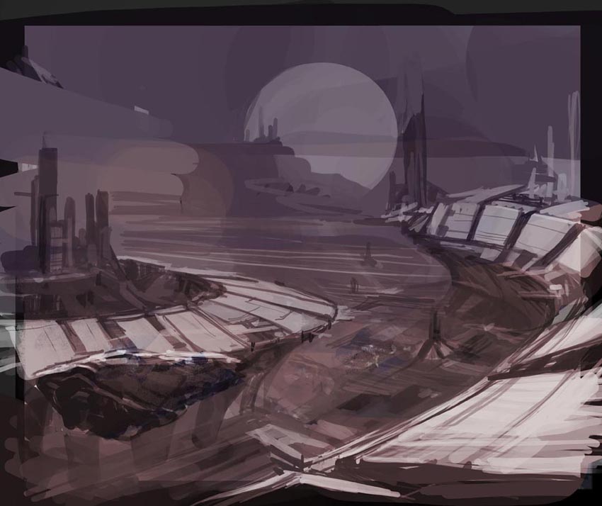 图片如下: 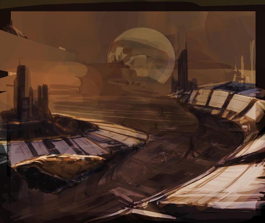 图片如下: 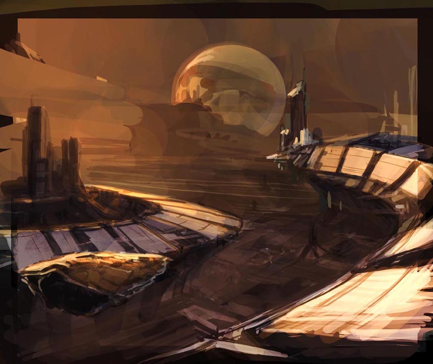
|
qinmenfei12
职务:普通成员
等级:2
金币:3.0
发贴:539
注册:2004/10/12 10:40:45
|
#292004/12/20 17:38:10
en,是新建一个图层,用叠加的属性继续深入画下去的,我想 我也困惑:从单色速写素描到上色的衔接...sparth的应该是这样,但mullins那些就...反正他以是随心所欲的境界了...我等凡人.... 图片如下: 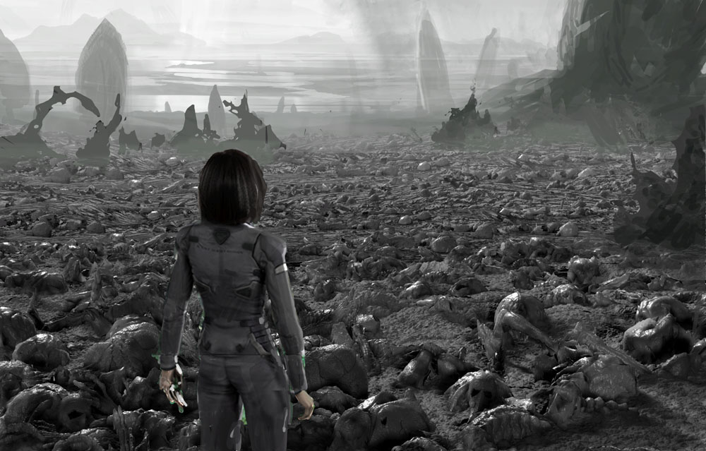
|
qinmenfei12
职务:普通成员
等级:2
金币:3.0
发贴:539
注册:2004/10/12 10:40:45
|
#302004/12/20 22:36:57
不能再拖了...cad... 图片如下:  那斯的边缘怎能做到鬼魅般的精确???我的630不行了吗.....21,46的差距.... 赶在圣诞前补完.... 图片如下: 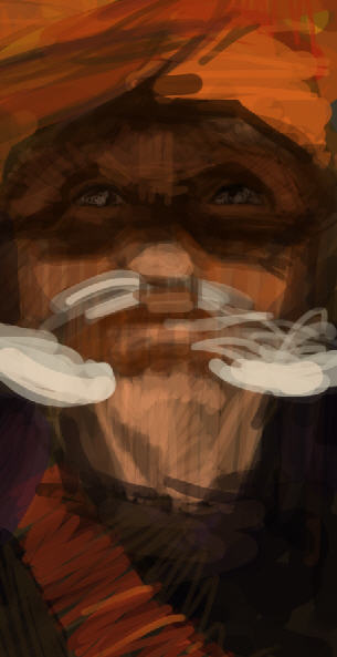
编辑历史:[此帖最近一次被 qinmenfei12 编辑过(编辑时间:2004-12-24 23:13:28)]
|


